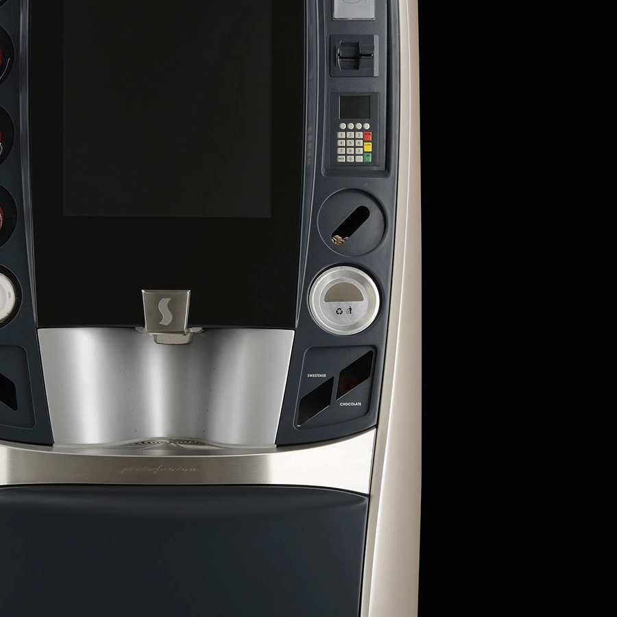
Pininfarina wrote a story around the concession able to replicate the atmosphere of the Costa stores, creating a sense of familiarity in the consumer. The design concept is characterized by sinuous lines conveying an elegant look reminiscent of the automotive world. The curving traits suggest the cut of the coffee beans and the S of the Costa logo – creating therefore a trait-d’union with the world of coffee and the one of Costa. The colours used – black for coffee and red for Costa – make the message even stronger and more consistent. Great attention was paid to the usability of the machine to guarantee a simple and intuitive selection process, an efficient and quick experience able to make the consumer feel comfortable. The service shelf, shaped as a dashboard, is spacious and inviting. All of the consumable elements, such as cups, sugar and stirrers, are very easy to reach in order to make the customer experience quick and simple. Beyond the excellence in design, the project is also highly technologically advanced thanks to the team work of Atomhawk, Bsquare, Costa, eMixPro, Givaudan, Global Capital Advisors, Intel, Perspectives, Thermoplan, Verwo-Aquacut.
Partners: Atomhawk, Bsquare, Costa, eMixPro, Givaudan, Global Capital Advisors, Intel, Perspectives, Thermoplan, Verwo-Aquacut

